Using cbsodataR to plot total deaths per week in the Netherlands from 1995 to 2020 (OC from reddit)
Update 7 December 2020: code chunk to download CBS data was not visible but is now added. This also leads to an update in the downloaded CBS data (kept for this post).
Background
The other day I was browsing through reddit when a post in r/dataisbeautiful caught my attention. The title stated [OC] Total deaths per week in the Netherlands from 1995 to 2020 and showed a graph with several lines. User theorange1990 plotted the weekly total deaths in the Netherlands between 1995 and 2020, together with an “Upper Bound” line. In addition, three more labels were included in the figure, pointing to “2018 - Flu epidemic in the Netherlands”, “2020 - so far”, and ‘“Upper Bound” of a normal year curve’.
What stood out was one yellow curve, peaking on the y-axis. This one was labelled with “2020 - so far”. It didn’t look long for the community to point to some methodological flaws of plotting the data “as is”, but I was interested in where the data were actually coming from. In the authors citation, theorange1990 mentioned the source to be Statistics Netherlands (CBS), the national statistical office of the Netherlands and just below the sentence: “Data organized and graphed using Excel”.
While Excel is of course a valid tool for such simple plotting exercises, I wanted to see if and how I can replicate this graph in R.
The replication took about 10-15 minutes with downloading the most recent data from the CBS servers directly into R. This approach has several advantages:
- R is getting newest data directly from the CBS server (no separate downloading, saving, opening, transformation from .csv to .xlsx by hand necessary)
- The code can easily be shared (what I do here) and everyone running the script will received the same result
- With new data points becoming available, the plot is “updating itself”
In the following, I want share my approach.
Needed packages
- tidyverse for data cleaning, transformation and visualisation
- cbsodataR open data API client for CBS
CBS data
Download with CBS API: cbsodataR
To download the same data as the reddit author, we look at his/her link provided in the post: https://opendata.cbs.nl/#/CBS/en/dataset/70895ENG/table
Clicking the link brings us to the online table but we just need the “table
identifier” which is a unique table ID for each CBS tables. I found these difficult
to find on the table website but if you have the link, the identifier is part of
its URL. In this case this is 70895ENG.
Let’s start writing the R script.
# Load needed packages
library(tidyverse)
library(cbsodataR)

# Import data from CBS using the table identifier
db_cbs <- cbsodataR::cbs_get_data("70895ENG") %>%
        cbs_add_label_columns() # Without this line we only see codes for each observation which are difficult to interpret
Now that we have downloaded the table, let’s have a look at it.
head(db_cbs)## # A tibble: 6 x 7
## Sex Sex_label Age31December Age31December_l… Periods Periods_label Deaths_1
## <chr> <fct> <chr> <fct> <chr> <fct> <int>
## 1 T0010… Total ma… 10000 Total 1995X0… 1995 week 0 … 394
## 2 T0010… Total ma… 10000 Total 1995W1… 1995 week 1 2719
## 3 T0010… Total ma… 10000 Total 1995W1… 1995 week 2 2823
## 4 T0010… Total ma… 10000 Total 1995W1… 1995 week 3 2609
## 5 T0010… Total ma… 10000 Total 1995W1… 1995 week 4 2664
## 6 T0010… Total ma… 10000 Total 1995W1… 1995 week 5 2577Tidy data
The formatting looks different from the format on the table’s website, but this doesn’t matter for this plotting exercise.
One problem we have with the table though is that year and weeks are “smashed
together” into one variable: Periods or Periods_label.
We however want to plot deaths by week on the x-axis and each year should become one line. So we need to separate the years from the weeks.
Since Periods always has eight characters, it is easiest use this column and
separate the two information on time with substr().
Just as on the OC we are only interested in pooled data for:
- both sexes (see columns
SexorSex_label), - all age groups (see columns
Age31DecembetorAge31December_label), and - weeks 1 to 52 (weeks 0 and 53 were excluded since they do not appear in each year).
db_plot <- db_cbs %>%
  mutate(year = factor(substr(Periods, start = 1, stop = 4)), # extract year
         wk = factor(as.numeric(substr(Periods, start = 7, stop = 8)))) %>% #extract weeks
        filter(Sex == "T001038", # only keep data for both sexes
               Age31December == "10000",
               wk %in% 1:52) %>% # only keep weeks 1 through 52
        select(Sex_label, Deaths_1, year, wk) %>% # keep necessary data only
  mutate(Sex_label = factor(Sex_label))
Now that we have the data in a tidy way and kept only necessary columns, let’s have a look at it (first six rows should be enough).
head(db_plot)## # A tibble: 6 x 4
## Sex_label Deaths_1 year wk
## <fct> <int> <fct> <fct>
## 1 Total male and female 2719 1995 1
## 2 Total male and female 2823 1995 2
## 3 Total male and female 2609 1995 3
## 4 Total male and female 2664 1995 4
## 5 Total male and female 2577 1995 5
## 6 Total male and female 2536 1995 6Plotting data
In this exercise we will use a simple line chart with ggplot2. Since we have tidy data already we just needs to specify a few things.
ggplot(data = db_plot) +
  # plot lines
  geom_line(aes(x = factor(wk), y = Deaths_1, col = year, group = year)) +
  # add lables
  labs(title = "Deaths per week",
       x = "Week number",
       y = "Deaths",
       col = "Years") +
  # place legend and customise text size to make it all fit
  theme(legend.position = "bottom",
        legend.text = element_text(size = 7),
        text = element_text(size = 7)) +
guides(col = guide_legend(nrow = 3)) 
Remarks and additions
As opposed to Excel, R is not “smoothing” the lines between the different data points for each week. If this is a goal this post on stackoverflow might be something for you.
By the time of writing, rendering and finally pushing this post to github, there were more data available than in the post on reddit. I decided to plot these data as well.
Since the data have information on age categories, plotting several
graphs is quite easy. Instead of keeping only data for all age groups
(see filter(Age31December == "10000"),
we can keep all age groups and use the facet_wrap() function from ggplot2.
Notice
that I use scales = "free" to “zoom” into the different age groups.
db_plot2 <- db_cbs %>%
  mutate(year = factor(substr(Periods, start = 1, stop = 4)), # extract year
         wk = factor(as.numeric(substr(Periods, start = 7, stop = 8)))) %>% #extract weeks
        filter(Sex == "T001038", # only keep data for both sexes
               wk %in% 1:52) %>% # only keep weeks 1 through 52
        select(Sex_label, Deaths_1, year, wk, Age31December_label) %>% # keep necessary data only
  mutate(Sex_label = factor(Sex_label))

ggplot(data = db_plot2) +
  # plot lines
  geom_line(aes(x = factor(wk), y = Deaths_1, col = year, group = year)) +
  # add lables
  labs(title = "Deaths per week",
       x = "Week number",
       y = "Deaths",
       col = "Years") +
  # place legend and customise text size to make it all fit
  theme(legend.position = "bottom",
        legend.text = element_text(size = 7),
        text = element_text(size = 7)) +
  guides(col = guide_legend(nrow = 3)) +
  facet_wrap(~ Age31December_label, scales = "free")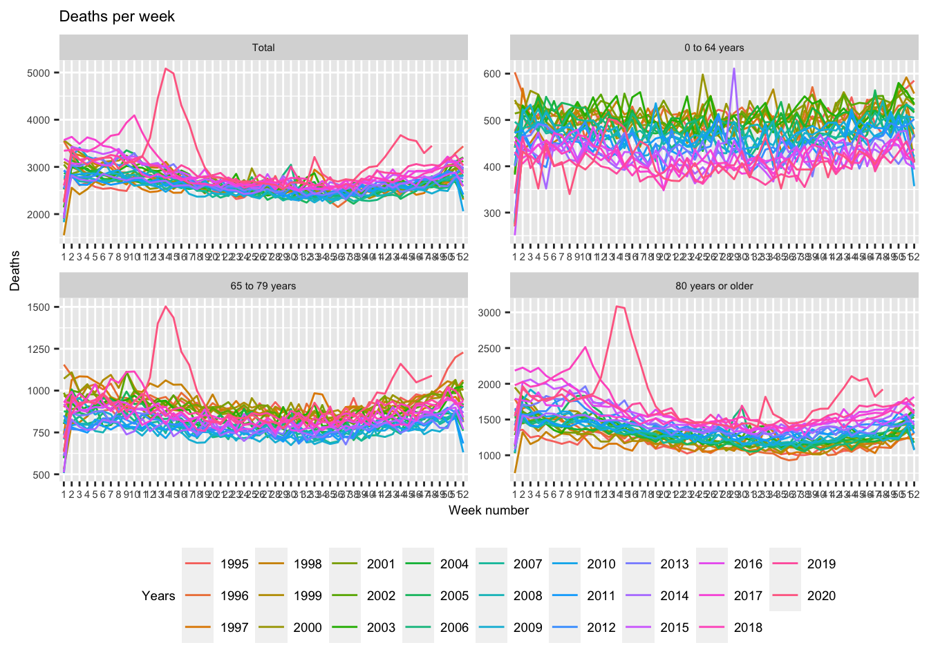
Finally, we could also only include the last five years of data to avoid any discussions of the data not being comparable due to ageing, migration patterns, advances in vaccination programmes etc.
We can filter data in ggplot() directly:
ggplot(data = filter(db_plot2, year %in% 2015:2020)) +
  # plot lines
  geom_line(aes(x = factor(wk), y = Deaths_1, col = year, group = year)) +
  # add lables
  labs(title = "Deaths per week",
       x = "Week number",
       y = "Deaths",
       col = "Years") +
  # place legend and customise text size to make it all fit
  theme(legend.position = "bottom",
        legend.text = element_text(size = 7),
        text = element_text(size = 7)) +
  guides(col = guide_legend(nrow = 1)) +
  facet_wrap(~ Age31December_label, scales = "free")
Conclusion
This post is avoiding any discussion on the usefulness of the data to interpret the COVID-19 pandemic on purpose. Instead it shows how to easily retrieve up-to-date data from CBS and plot them with a few lines of R code. The advantage to this approach (as opposed to plotting in Excel) is that the graphs are produced in a transparent and reproducible way and that they can be updated on a weekly basis (each time new data is becoming available). This post can serve as a use case for the cbsodataR package or even ggplot2 (although for the latter there are much better examples out there).